The Shift: A New Visual Language for a New Kind of Sports Show

A New Direction in Sports Storytelling
In the evolving landscape of Canadian sports media, The Shift emerged as something bold and necessary: a fresh, unapologetic platform that brings together sports, life, and culture—through a uniquely Canadian lens.
Hosted and co-executive produced by TSN’s Kayla Grey, The Shift features a collective of diverse voices tackling timely conversations with authenticity and edge. It doesn’t just cover sports—it covers the stories surrounding sport, elevating voices and perspectives that are often overlooked in mainstream coverage.
To bring this vision to life, the team needed a dynamic brand identity and motion system that could match the energy and originality of the show—and signal a clear shift in tone, style, and substance from traditional sports programming.
Brand a New Era in Canadian Sports Media
The brand had to be:
- Bold and expressive, reflecting the confidence of Kayla Grey and the show’s tone
- Flexible and multi-platform, adaptable to broadcast, web, social, and video-on-demand
- Inclusive and layered, capturing the cultural intersections that define the show’s voice
- In motion, quite literally—supporting dynamic graphics packages, video openers, and visual storytelling tools
This wasn’t just about designing a logo. It was about shaping a visual identity system that could live across platforms, support deep storytelling, and feel unlike anything else in Canadian sports media.


Our Approach: Design with Purpose and Pulse
Under the creative direction of Jan Werthwein, Partner at Locality, the brand system was crafted around the core values of authenticity, energy, and culture-forward storytelling.
Brand Identity
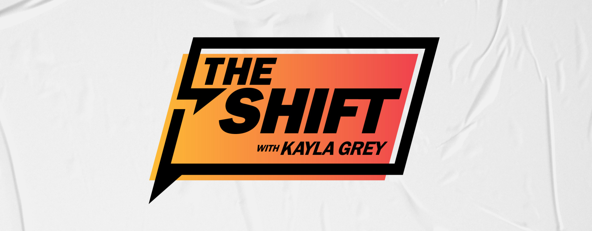
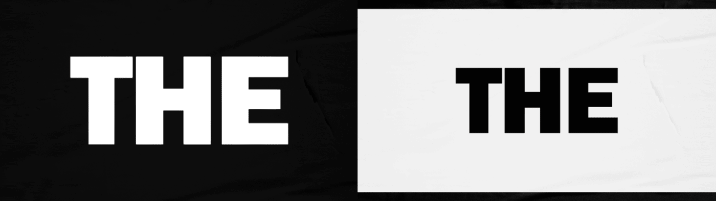
A wordmark that is sharp, compact, and modern—bold enough to stand on its own, versatile enough to integrate into screen layouts and visual overlays
A supporting typographic system with contrast and personality, used to emphasize urgency, voice, and conversation
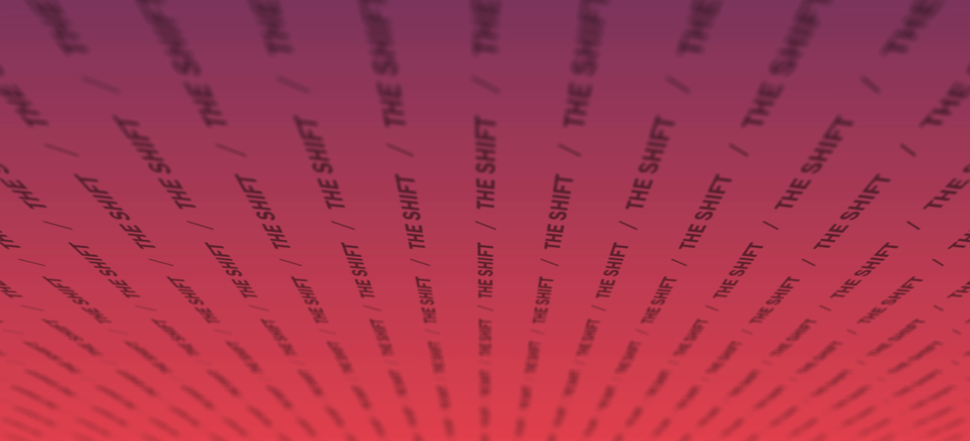
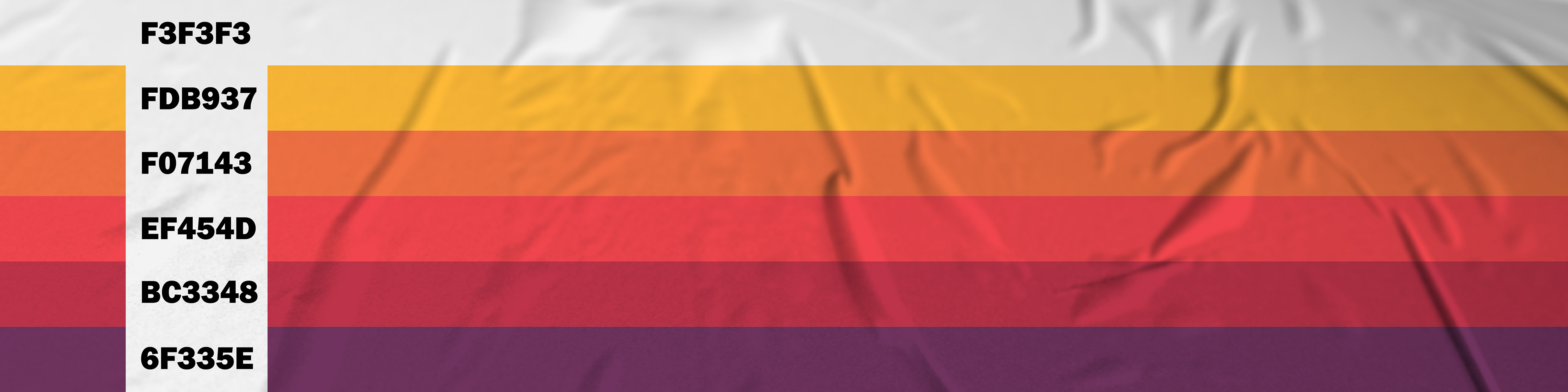
A colour palette that strays from traditional sports broadcasting—layered tones, graphic textures, and bold accents used to heighten impact and dimension.
Motion Graphics
High-energy animation sequences for show opens, transitions, and social cutdowns
Layered graphics and kinetic type that mirror the movement and momentum of the show’s conversations
Visual transitions that seamlessly blend footage, headlines, and soundbites—anchoring viewers in The Shift’s world
The motion system was built to scale—from polished long-form segments to quick-hit social content—allowing the brand to flex across platforms without losing its edge.


The Result: A Brand That Moves
The result is a brand and design system that:
- Captures the energy and originality of The Shift
- Supports storytelling with movement and style
- Amplifies Kayla Grey’s presence while creating room for others
- Differentiates from traditional sports programming with intention and swagger
The Shift is now a go-to for original Canadian sports culture—its brand and motion language helping carry its voice across digital, broadcast, and social in bold, unmistakable ways.


Why It Matters to Locality
This project represents what we love most at Locality:
- Telling bold stories with clarity
- Building brands with energy and identity
- Creating design systems that don’t just represent something—but move something forward
Jan Werthwein’s work on The Shift reflects Locality’s broader belief: that great design isn’t just visual—it’s cultural, emotional, and directional.
In a media landscape often bound by format, The Shift proves that thoughtful branding and motion can carve out space for something new, something now, and something necessary.
Client: The Shift with Kayla Grey (TSN / Bell Media)
Services Provided: Brand Identity, Motion Graphics, Visual Language Development
Industry: Sports Entertainment + Broadcast Media + Culture
Services Provided: Brand Identity, Motion Graphics, Visual Language Development
Industry: Sports Entertainment + Broadcast Media + Culture