The Mixed Network:
Designing a Bold Identity for a Growing Cultural Movement
Designing a Bold Identity for a Growing Cultural Movement
A Cultural Identity on the Rise
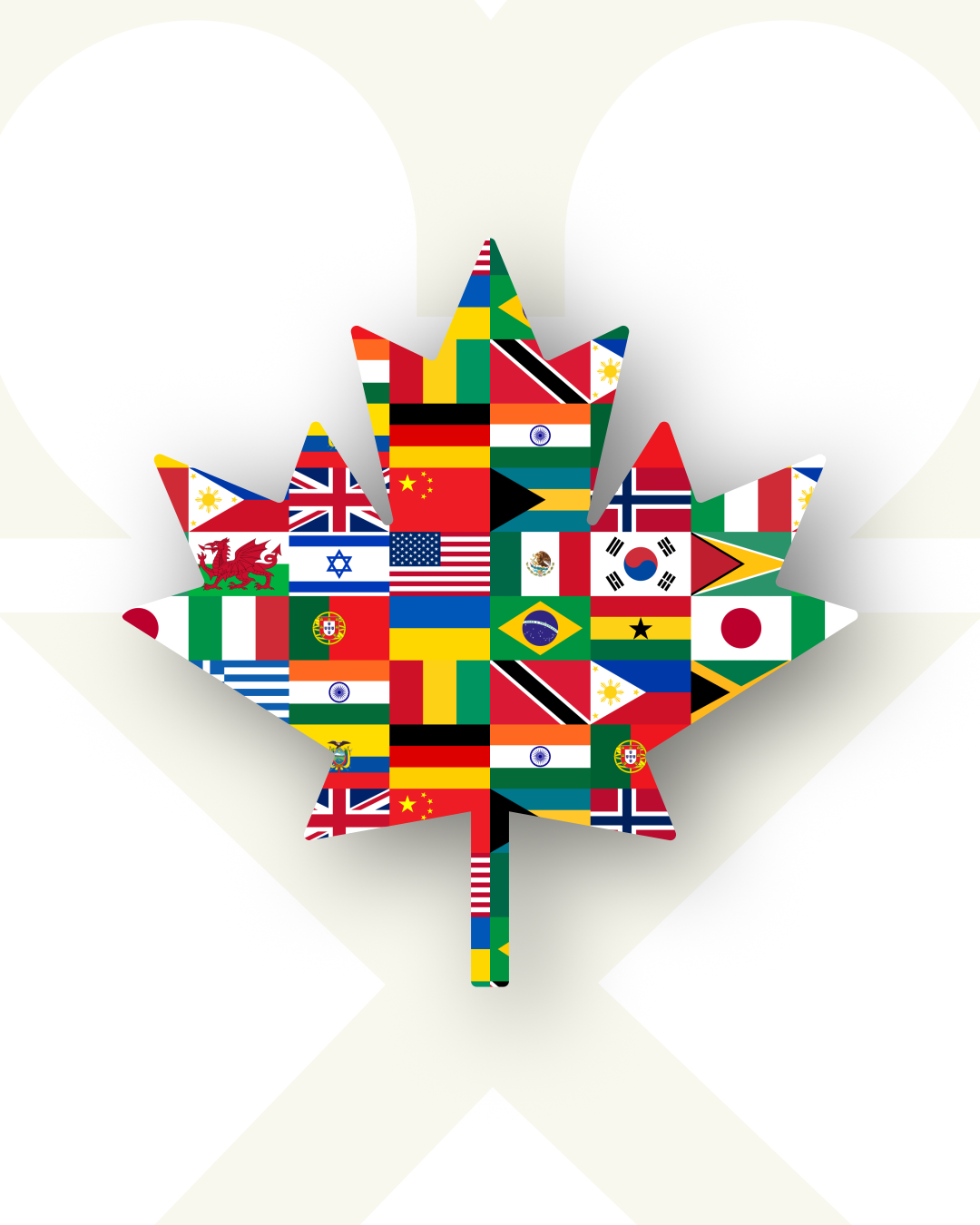
Canada is in the midst of a cultural transformation. With over 35.5% of Canadians identifying with multiple ethnic origins and 7% of all partnerships in Canada being mixed-race, a new kind of community is emerging—one that is diverse, vibrant, and multifaceted. However, this growing demographic remains underrepresented in mainstream narratives, branding, and public conversation.
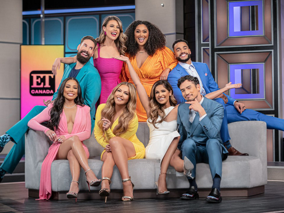
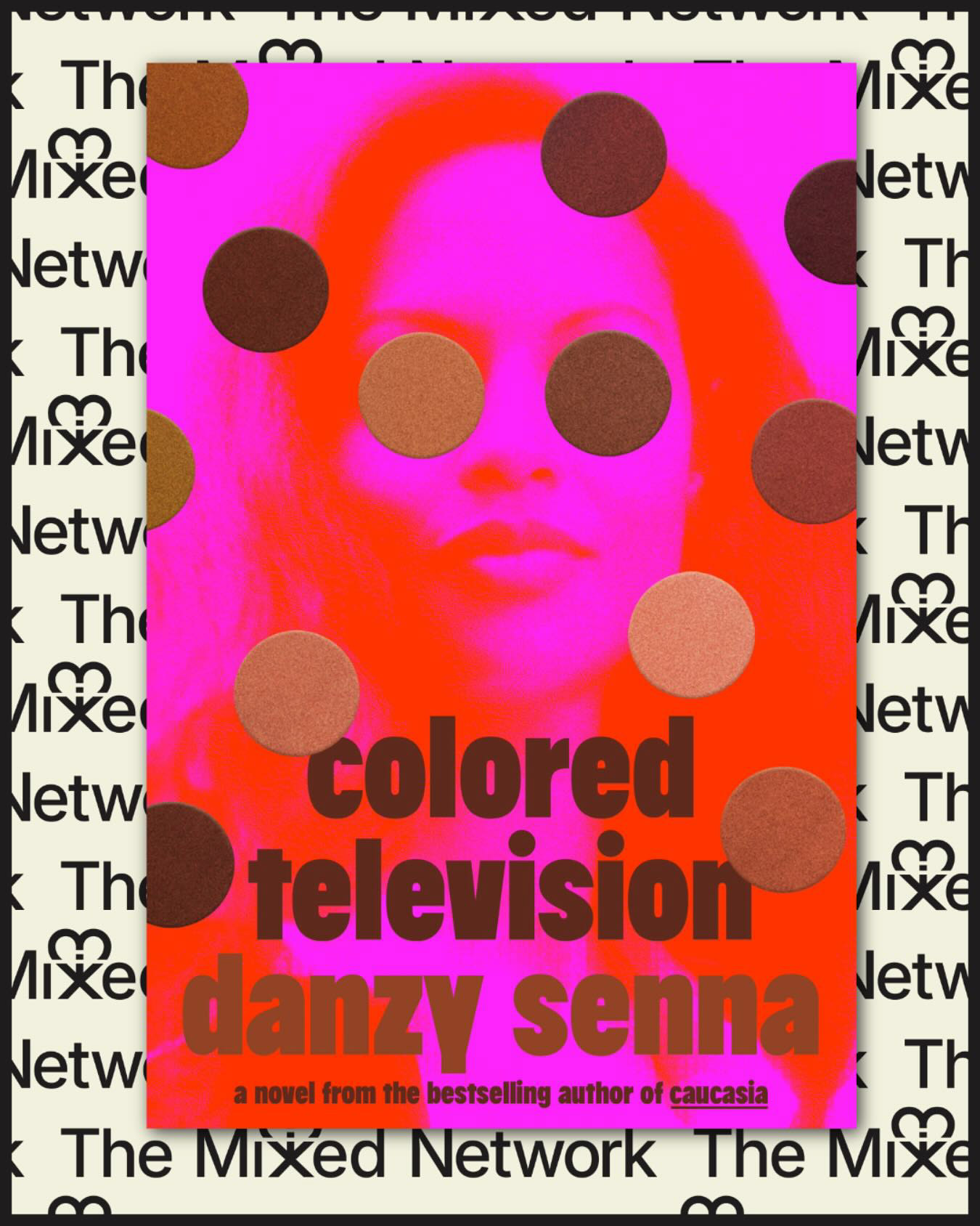
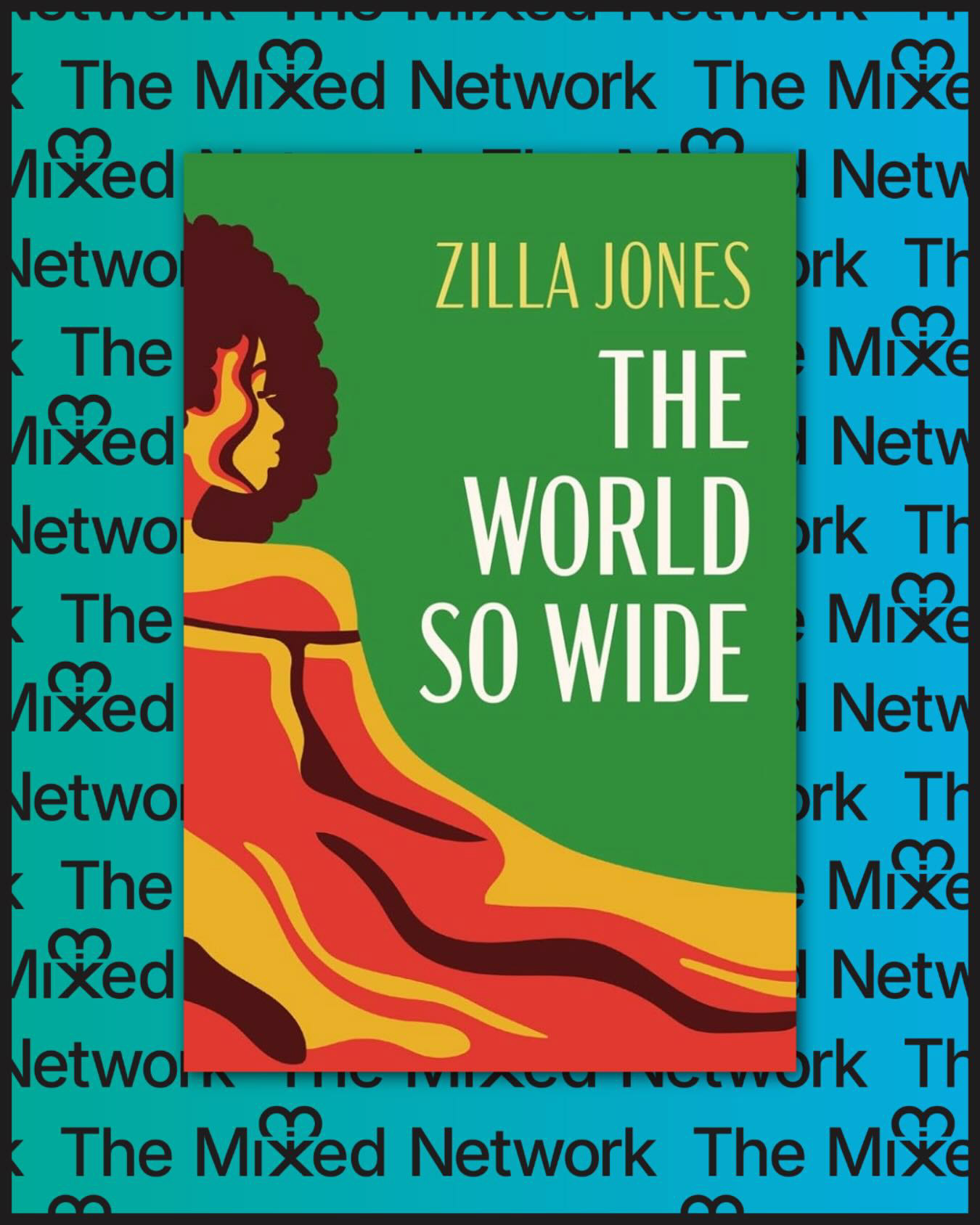
The Mixed Network was created to fill that void. It is an emerging platform built to celebrate the mixed-race experience, foster dialogue, and cultivate a sense of belonging. From digital talk shows to cultural storytelling, the network is positioned to become a hub for connection, identity exploration, and representation.

The Challenge: Give a Movement a Mark
The Mixed Network needed branding that could:
- Embody the complexity and beauty of mixed identities
- Serve as a recognizable icon for a growing cultural movement
- Reflect values of love, acceptance, diversity, and celebration
- Remain versatile for digital and physical applications
Our Approach: Design as Culture-Building
At Locality, we believe place branding isn’t just about geography—it’s about people, culture, and identity. As specialists in bringing economic development and community strategies to life, we recognized The Mixed Network as a vital part of building complete communities.
We approached the branding of The Mixed Network the way we would any community transformation project: by listening, researching, and designing from the inside out.
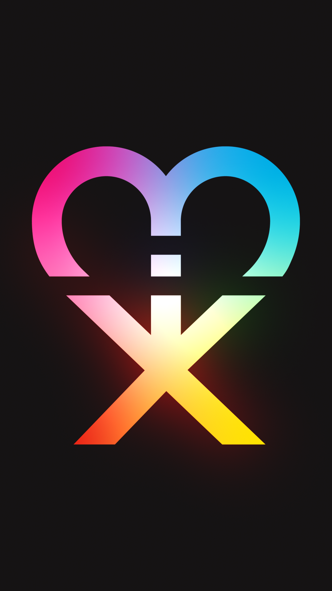
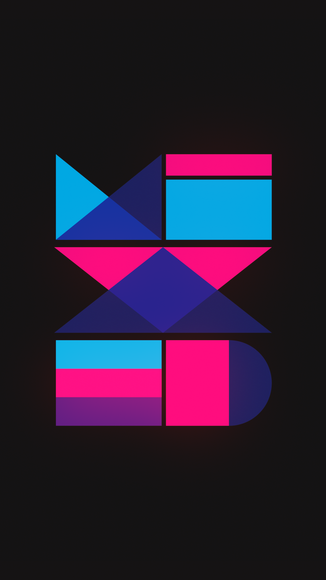
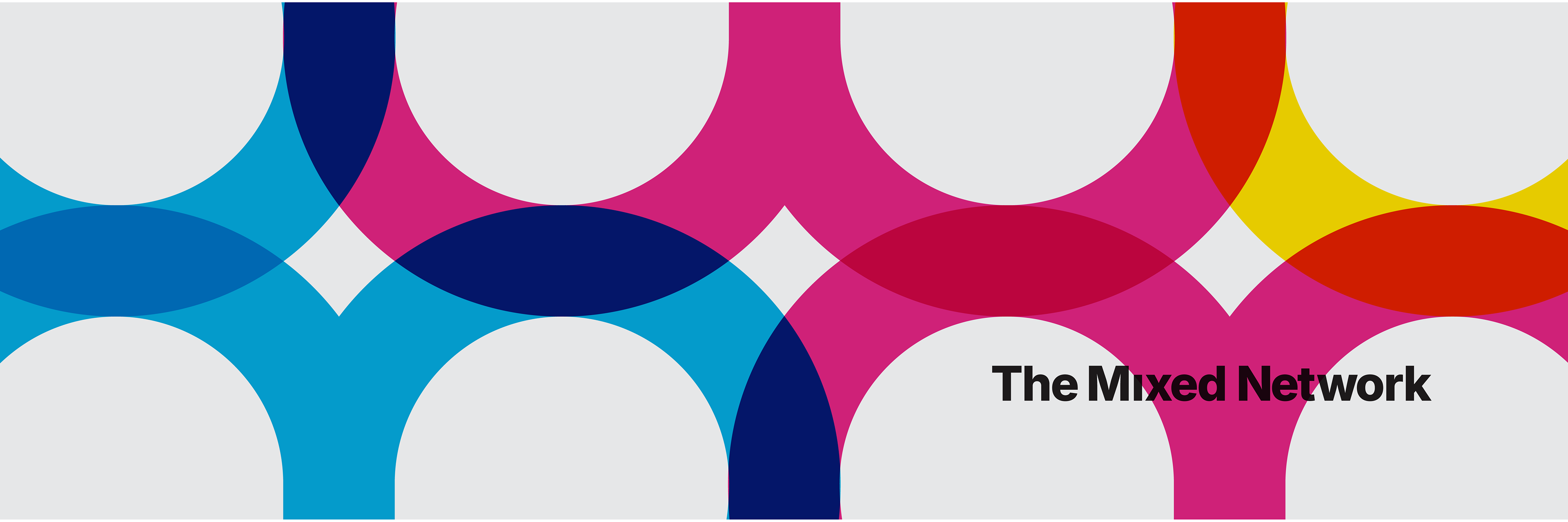
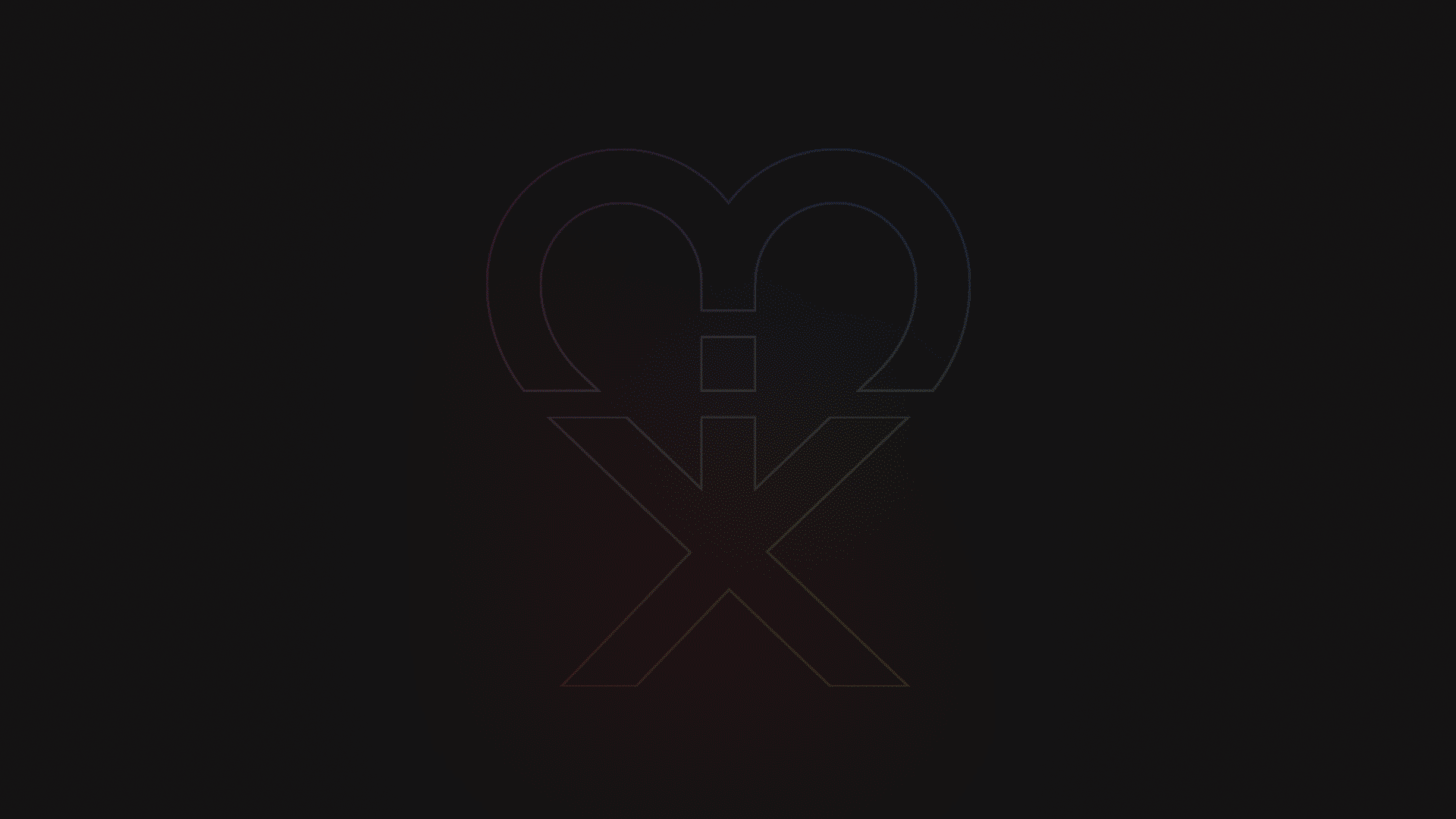
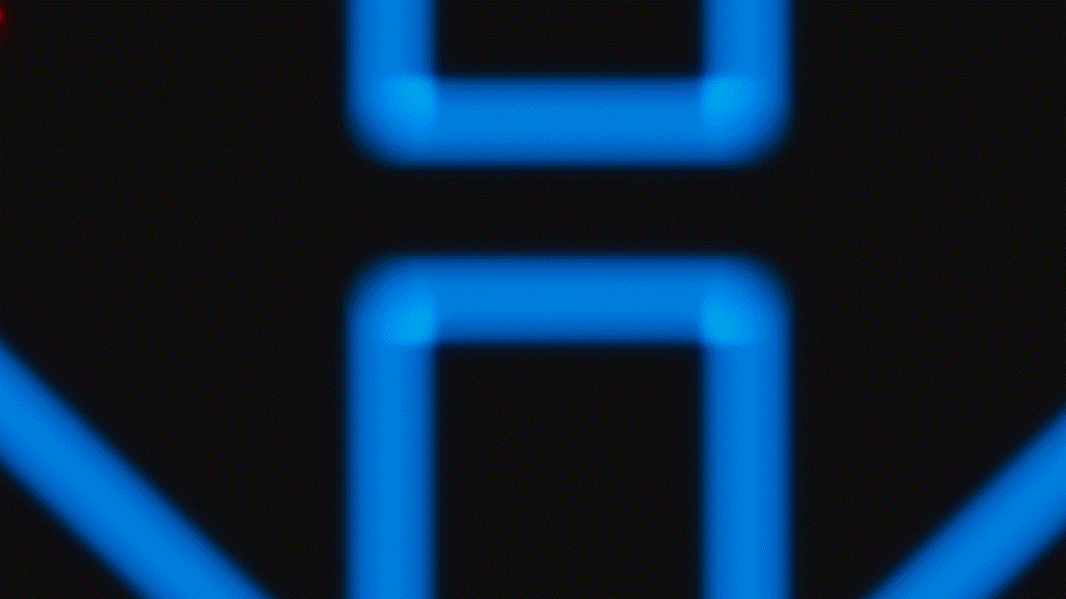
The Logo: Unpacking the "Mix"
We designed a logo that holds multiple meanings—just like the people it represents.
Wordmark Illusion: At first glance, the abstract shapes form a unique icon. But look closer, and you'll see the word "mix" subtly spelled out within the symbol.
Cultural Duality: The intertwined elements represent cultures coming together—blending while maintaining individual identity.
Love + Acceptance: A heart-like form emerges in the negative space, reinforcing the network’s core values.
Modern & Minimal: With clean lines and a flexible structure, the logo stands strong across platforms—from social media avatars to on-stage signage.
The result is a visual identity that is elegant, inclusive, and powerful. One that invites conversation and builds brand recognition while staying rooted in meaning.
Why It Matters to Locality.
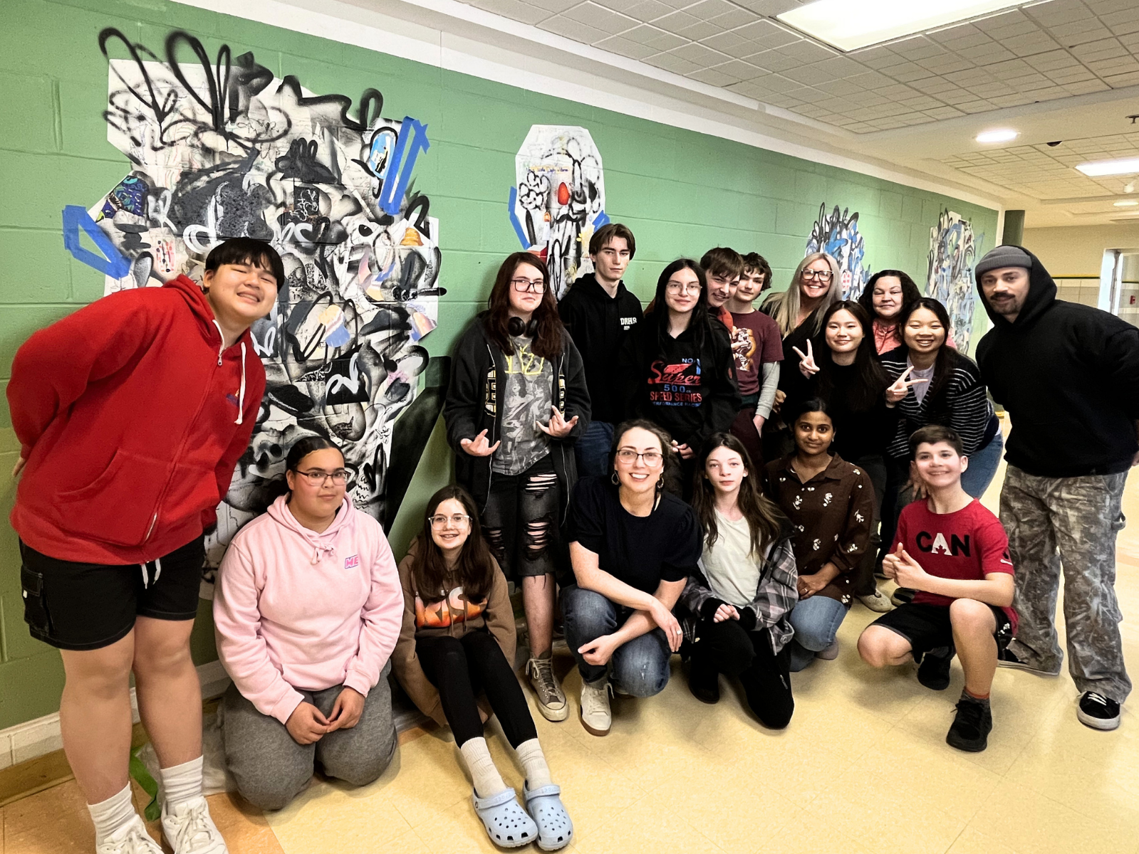
The Mixed Network is more than a media project—it’s community infrastructure. It represents how modern Canadian identities are evolving, and how communication, branding, and storytelling play a critical role in helping people see themselves reflected in the world around them.
At Locality, we’re proud to partner with organizations like this—those that build belonging, uplift underrepresented voices, and ultimately help communities put themselves on the map.
Services Provided: Logo Design + Visual Identity (in progress)
Industry: Community + Media + Culture
Industry: Community + Media + Culture