Locality Poster Series: A Graphic Love Letter to Place
What makes a place unforgettable?
How do you distill a city’s identity into something simple, striking, and iconic?
How do you distill a city’s identity into something simple, striking, and iconic?
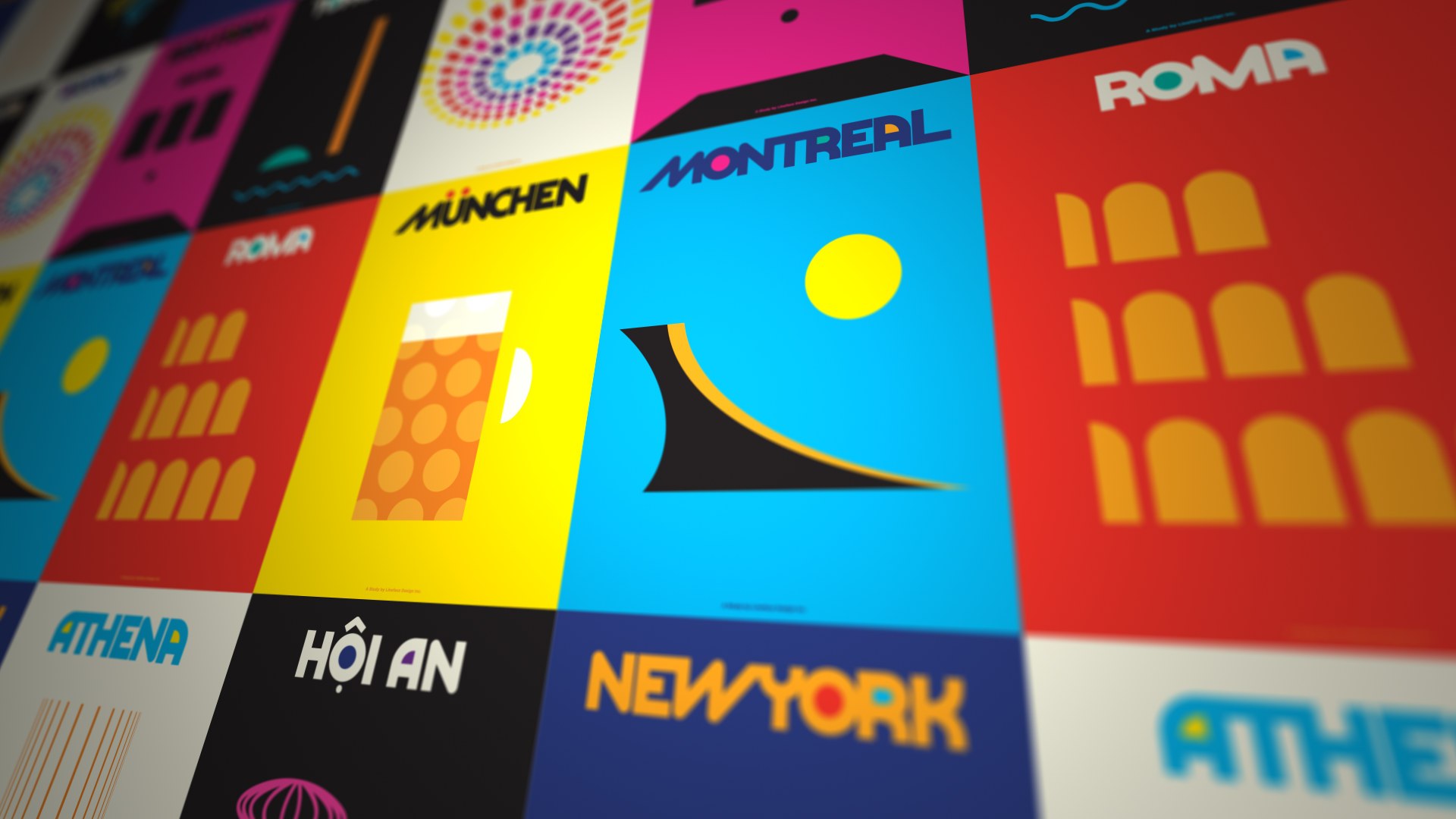
This poster series was born from that curiosity. What started as a design exercise became a passion project: a series of minimalist city posters using bold colour, clean typography, and simple form to spotlight local assets that are unmistakably theirs.
Say More With Less
Each poster had to answer one question:
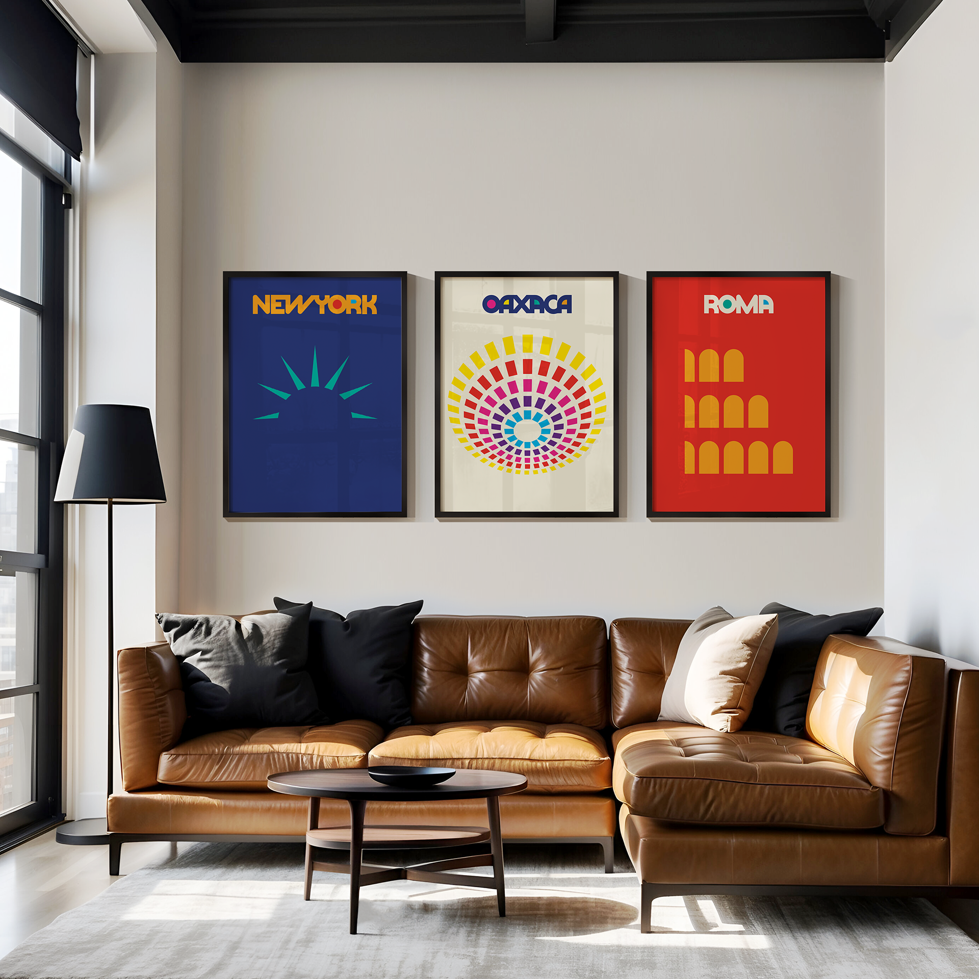
Can you recognize a city from a single shape or symbol?
Can you recognize a city from a single shape or symbol?
The goal was to reduce the complexity of a place into a single, compelling visual—a moment of instant recognition and emotional resonance. At the same time, the series served as a creative sandbox to:
- Explore typography and layout systems
- Celebrate design as storytelling
- Reinforce Locality’s belief that design is a tool for economic and cultural connection
Minimal Form, Maximum Impact
The process was guided by three design principles:
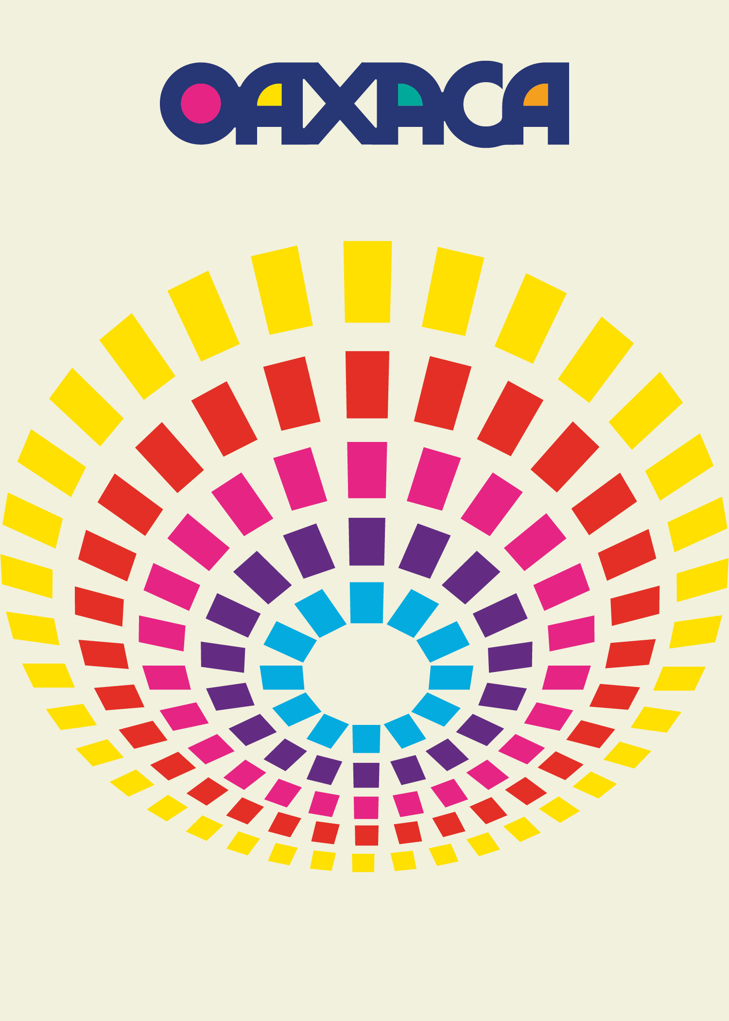
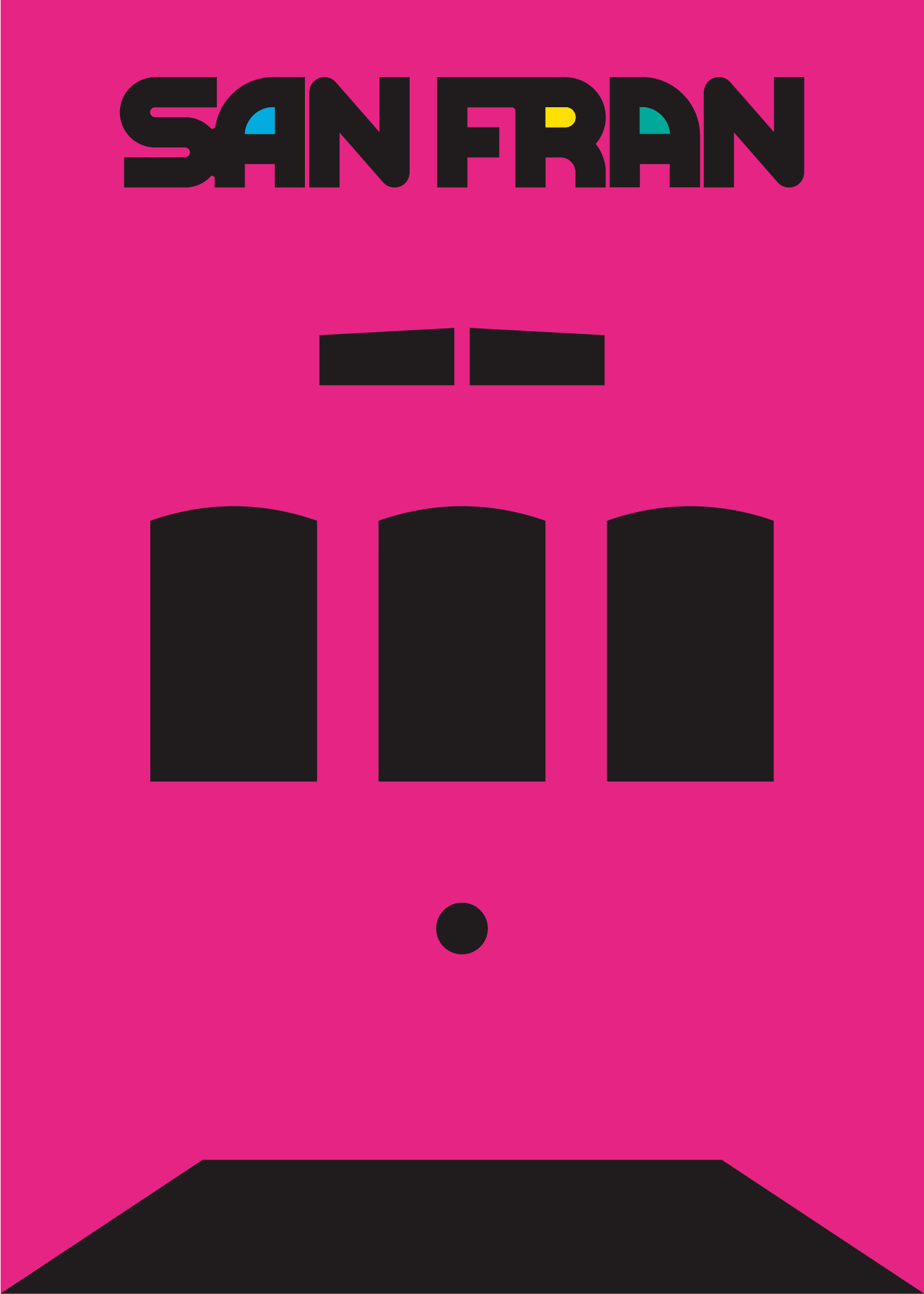
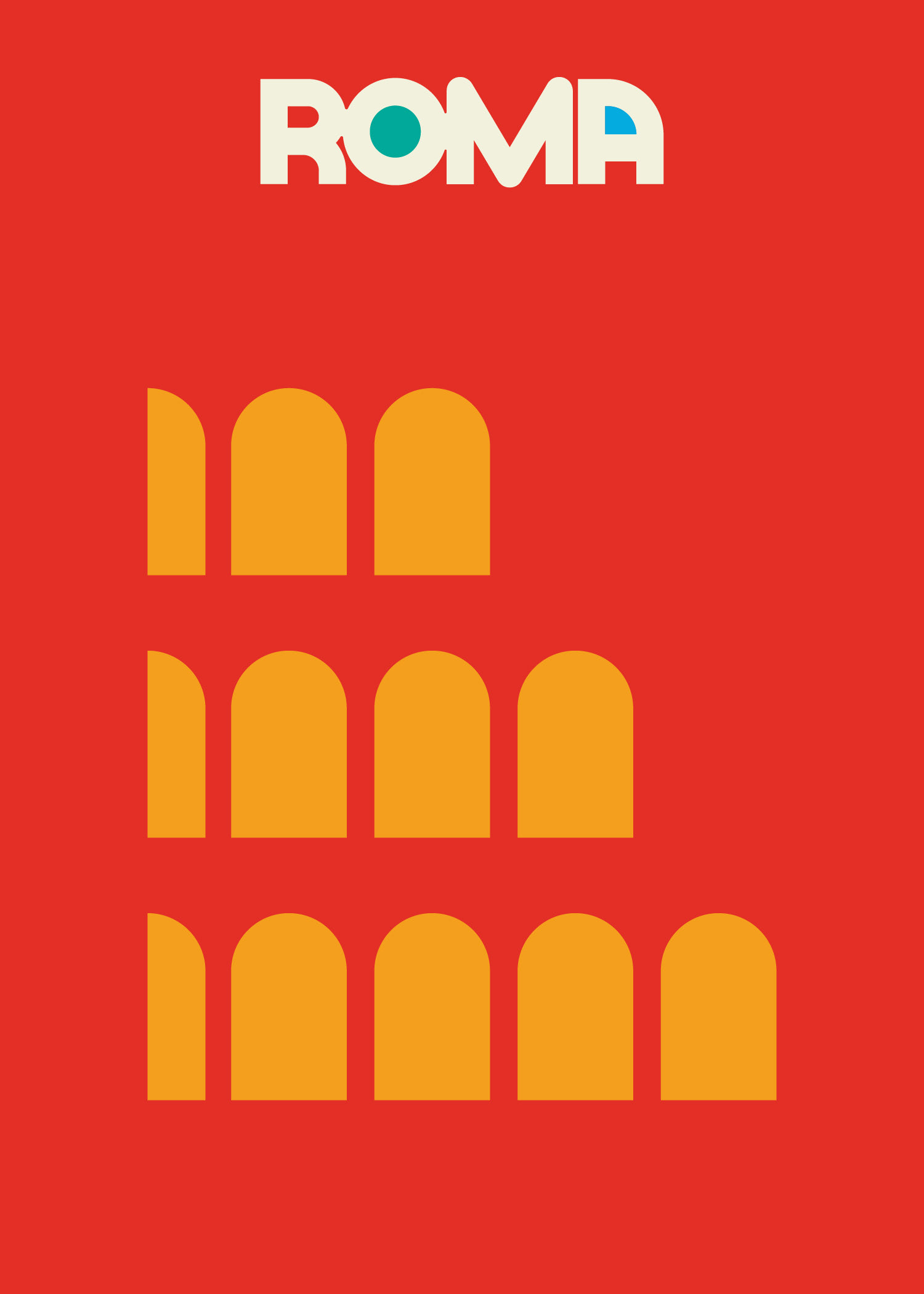
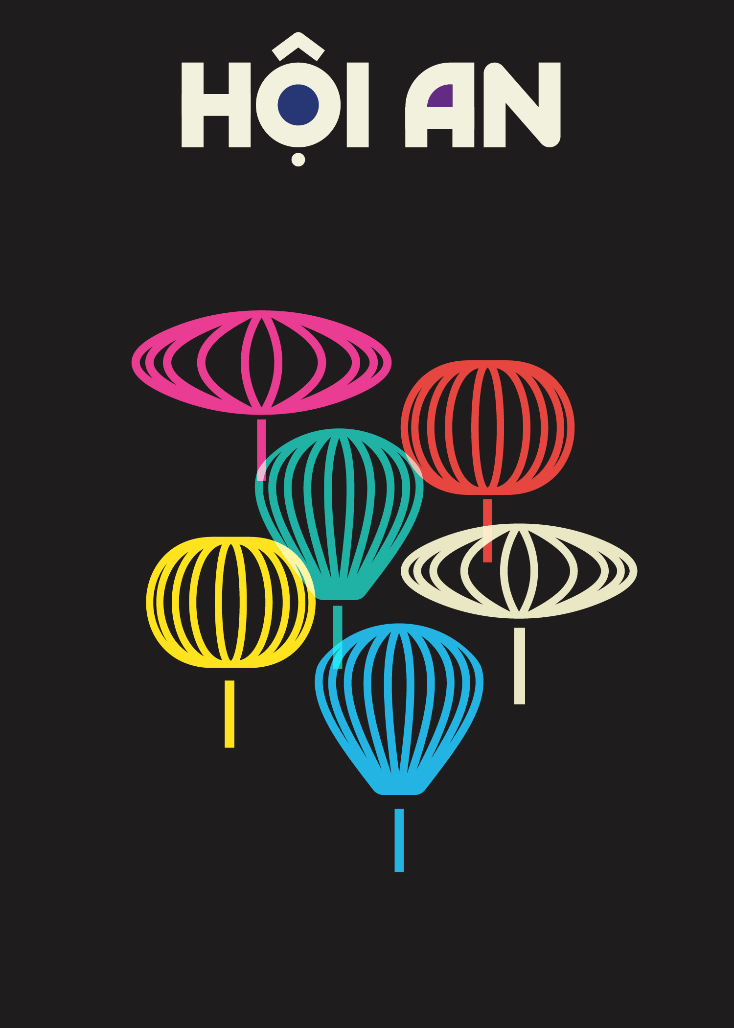
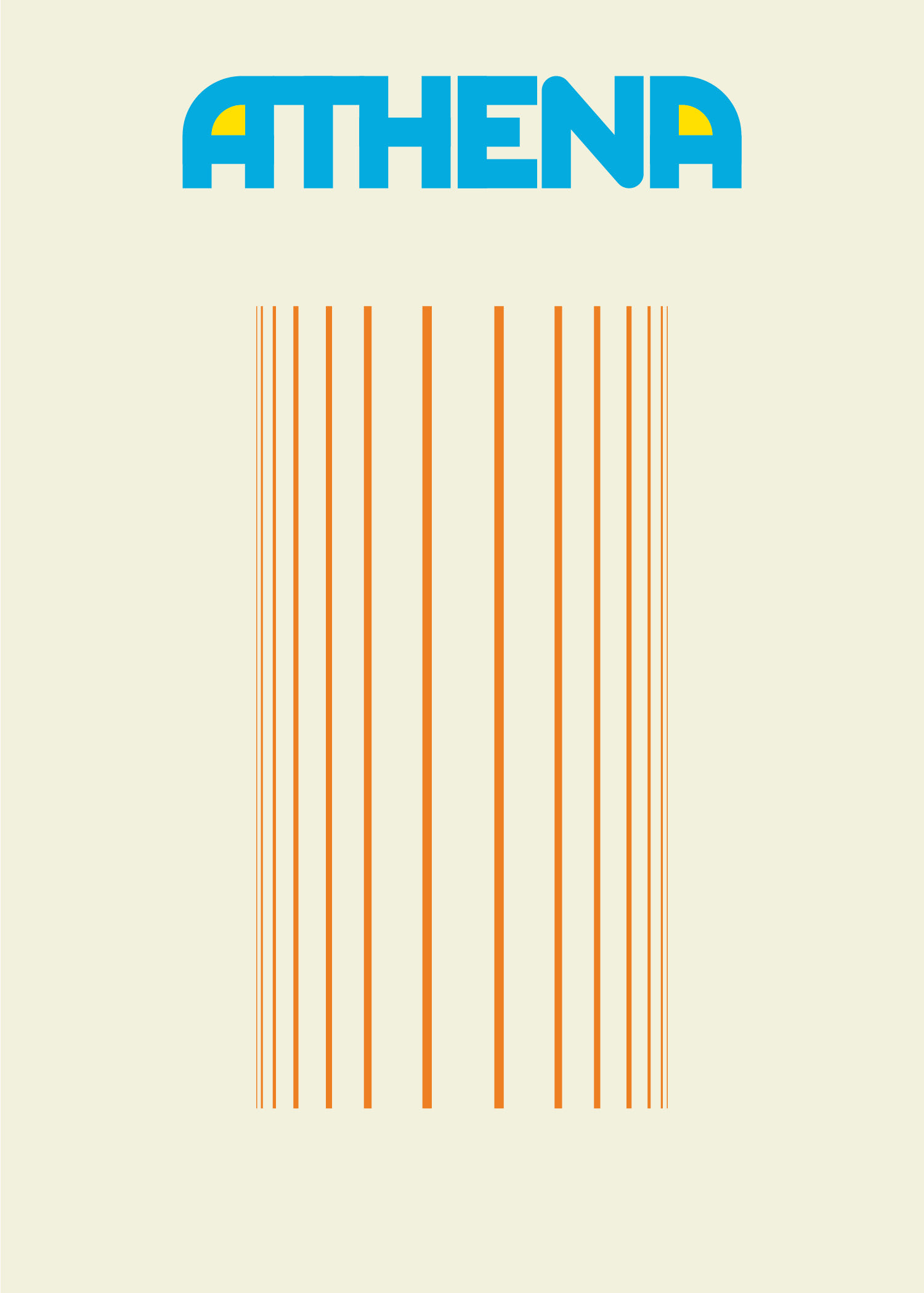
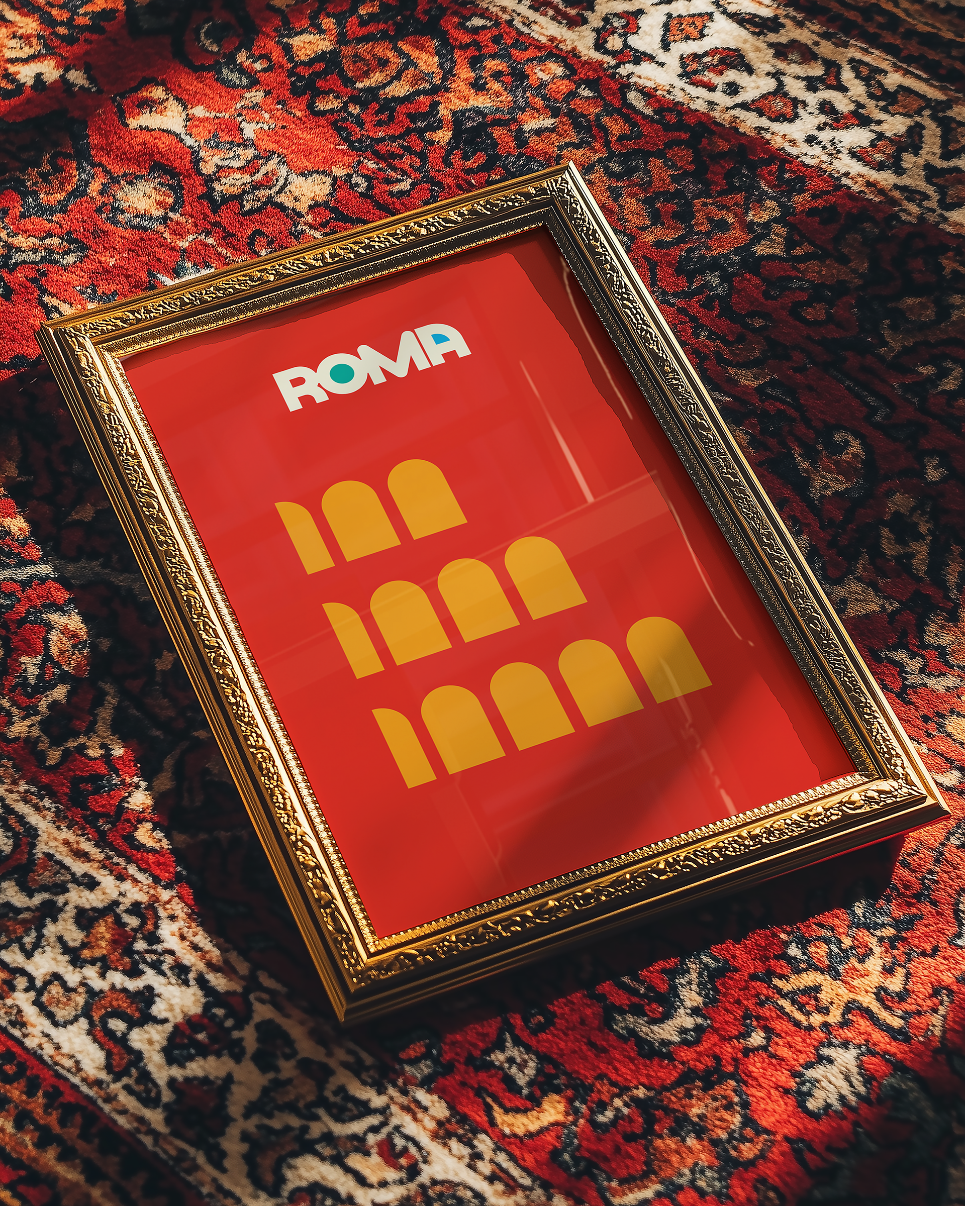
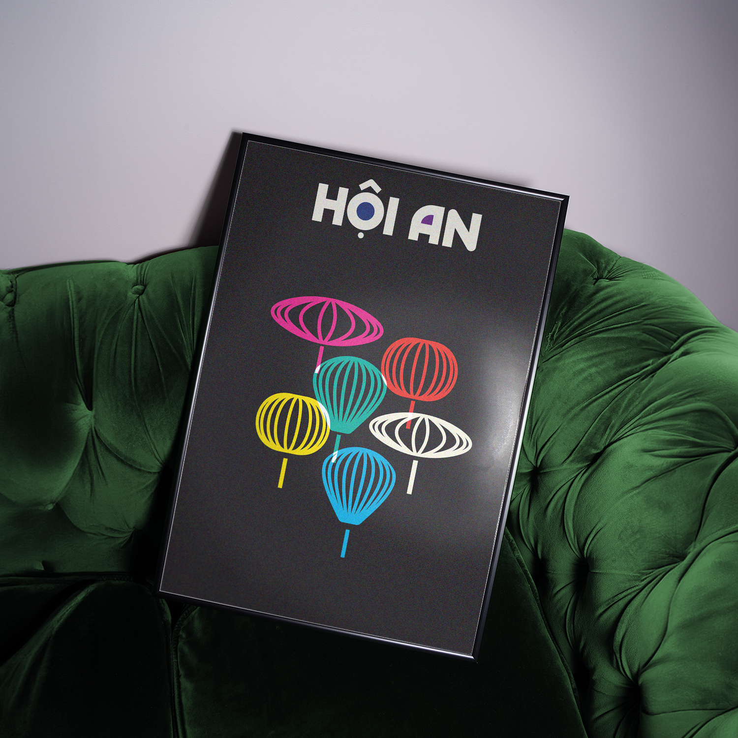
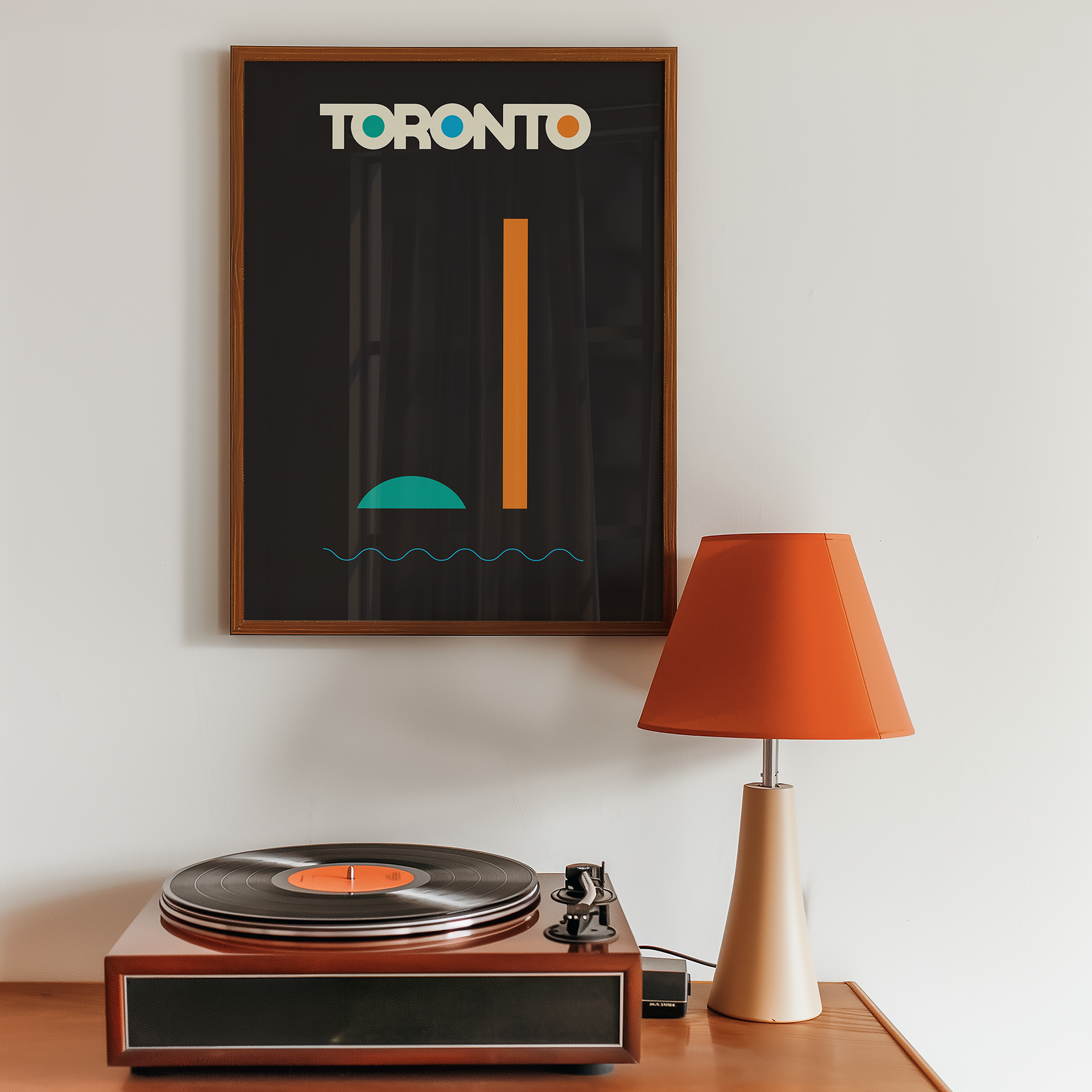
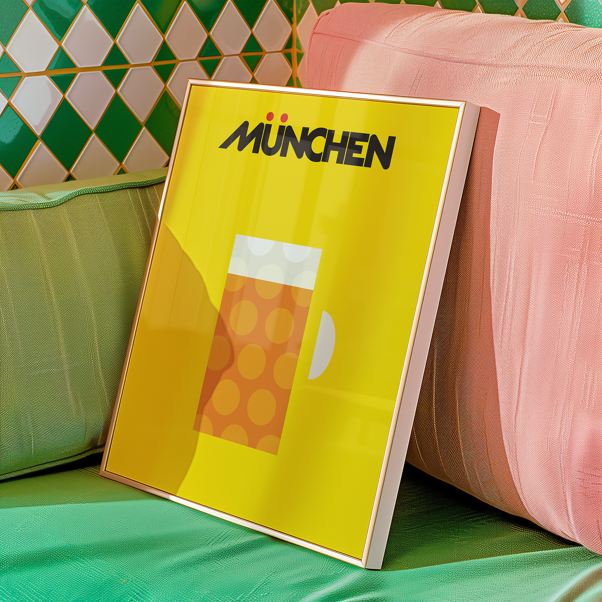
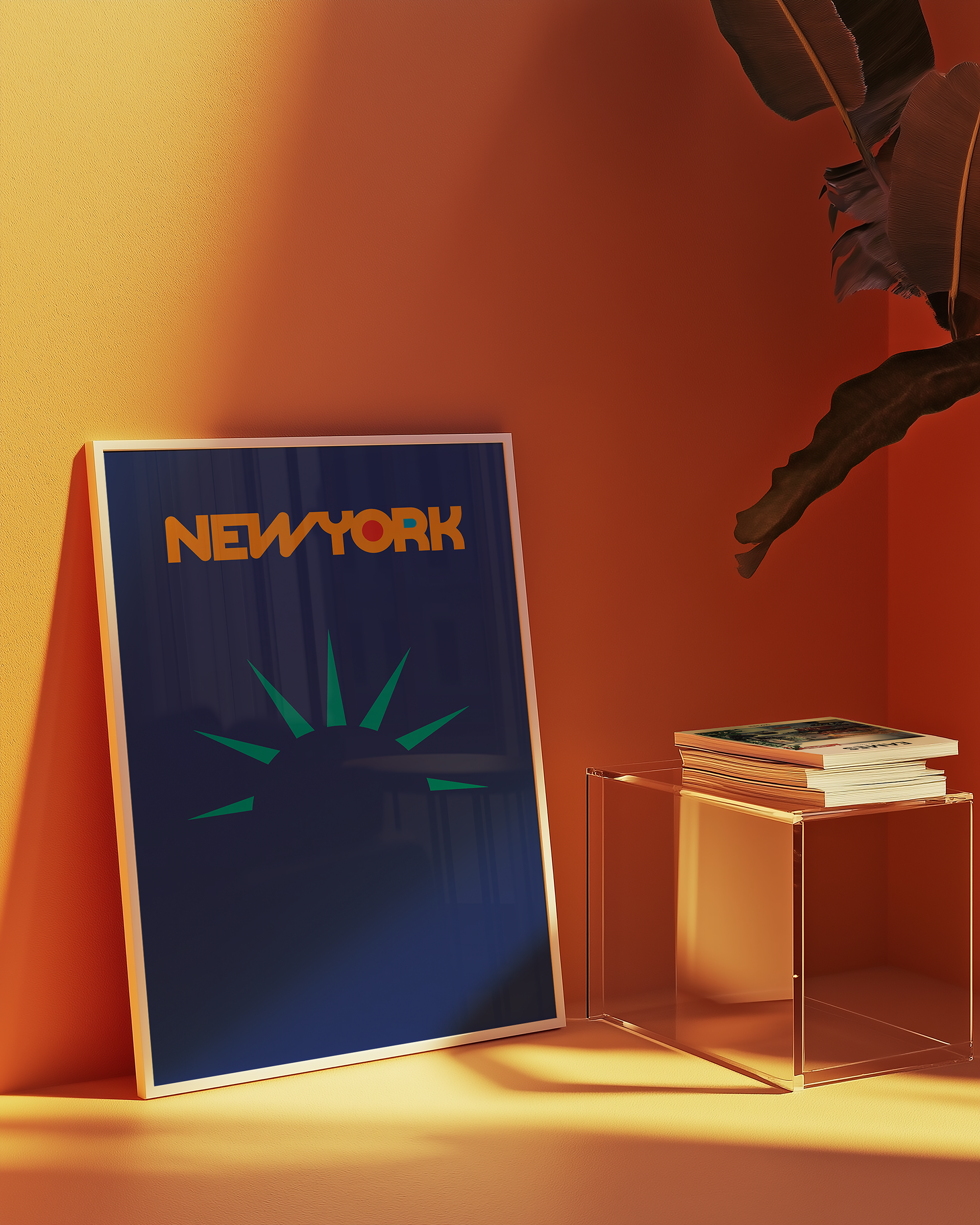
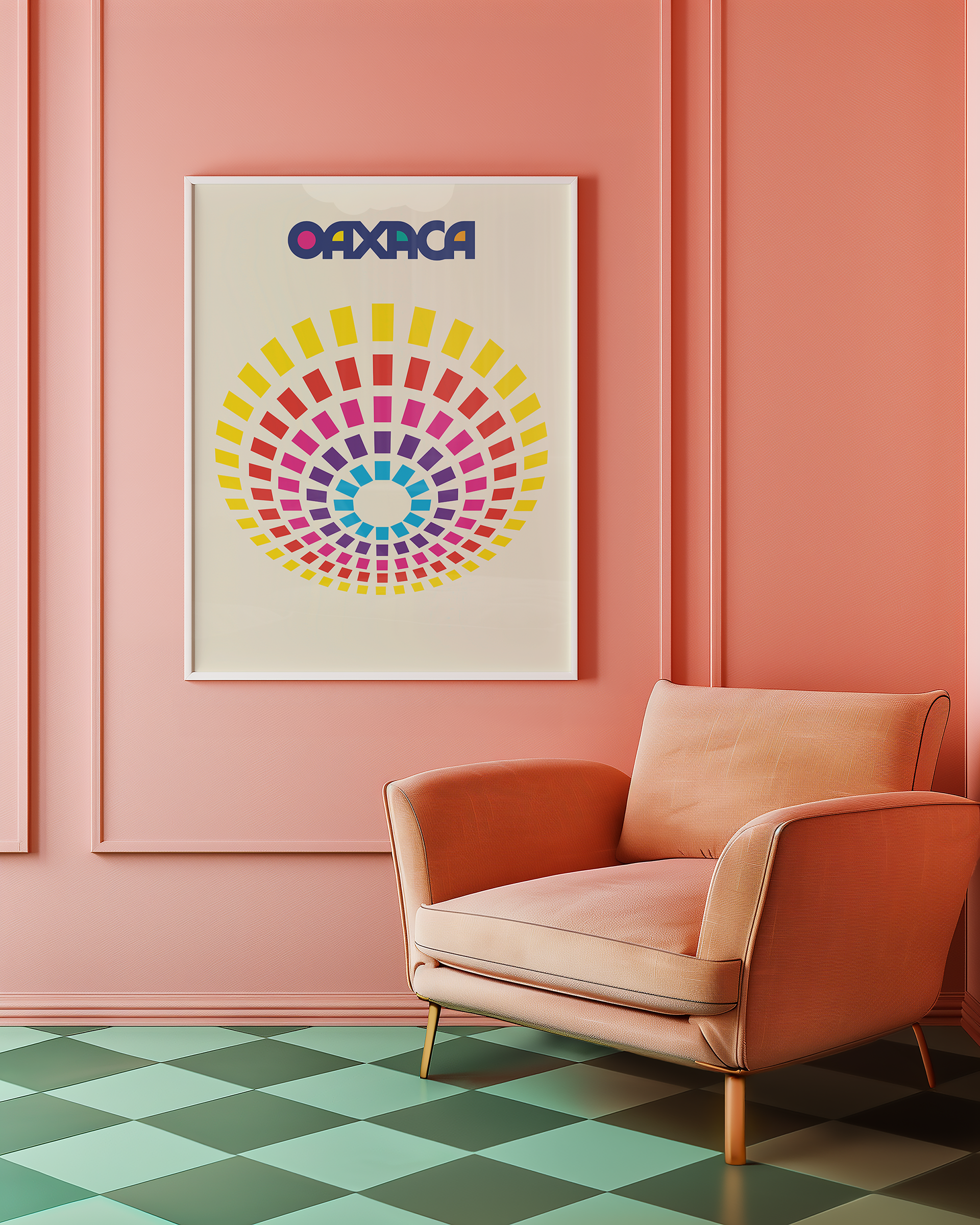
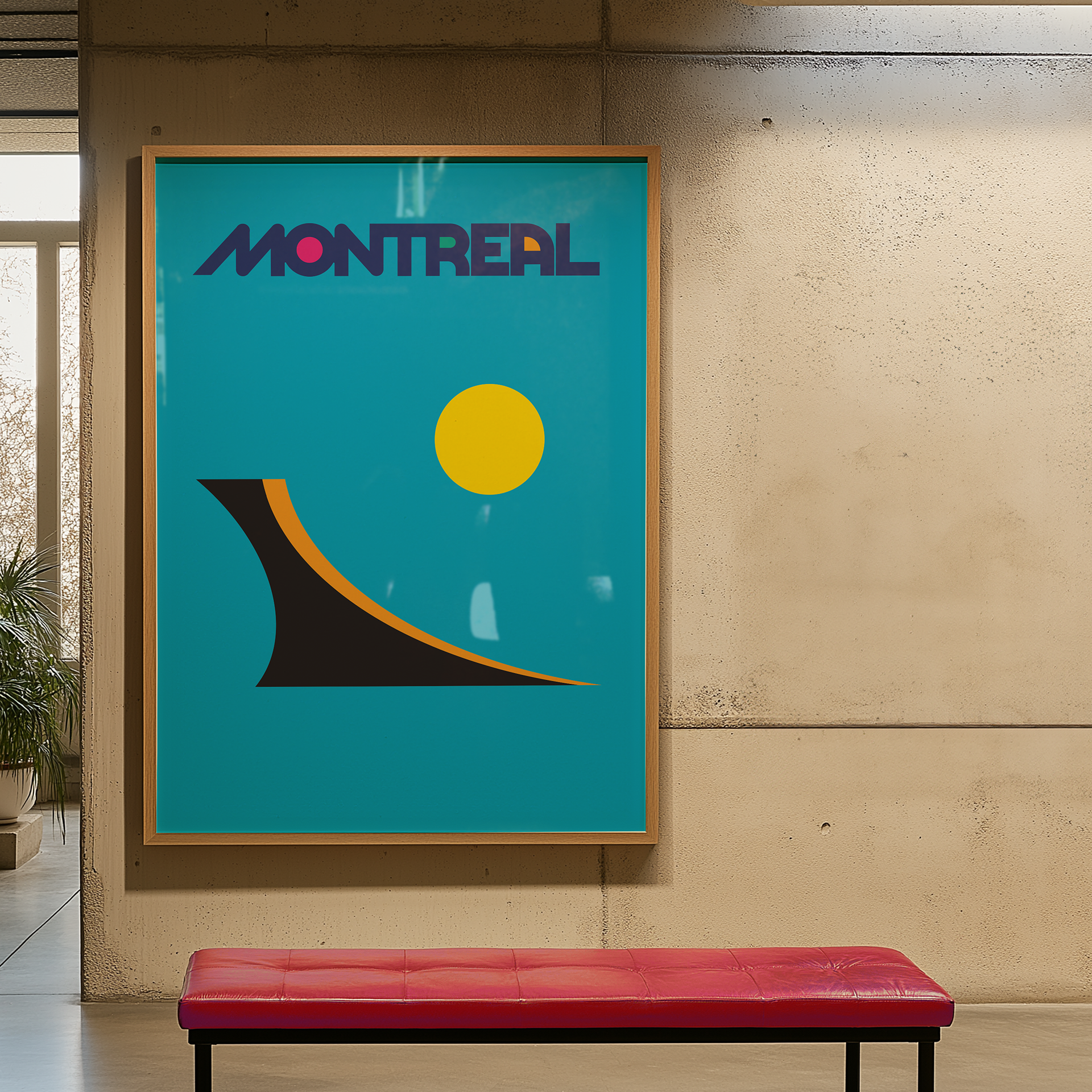
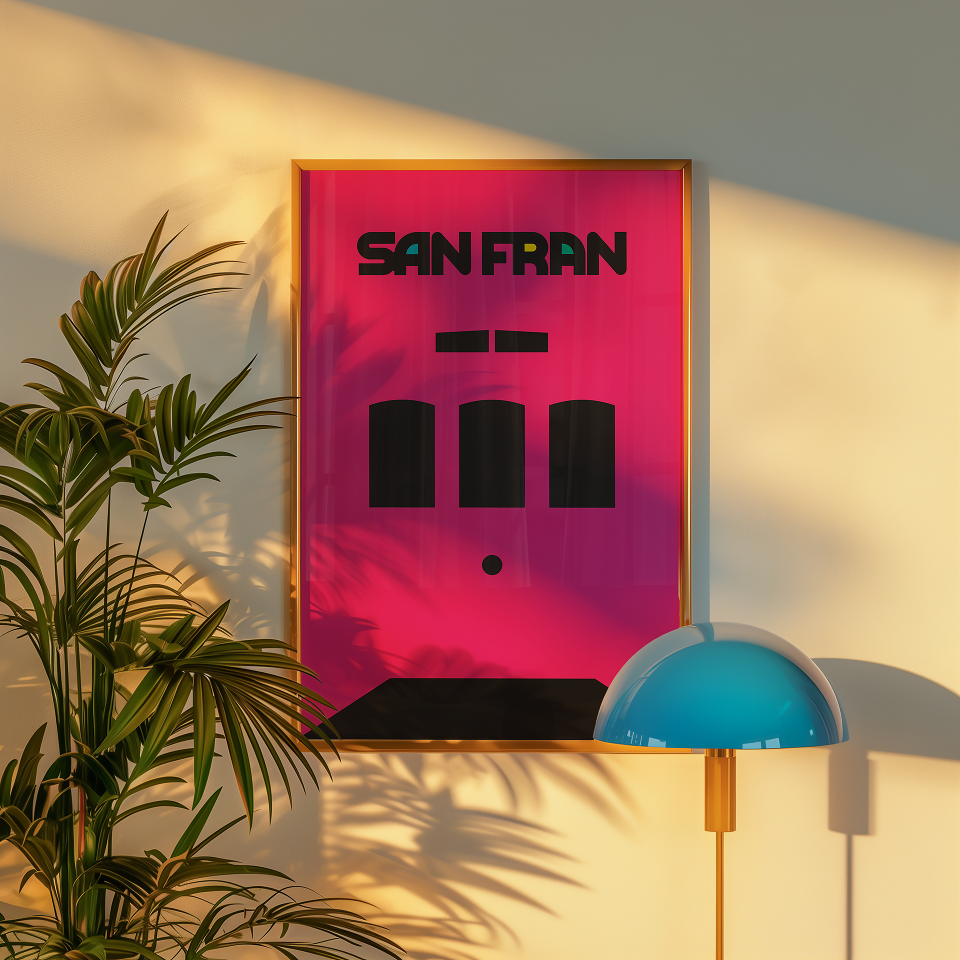
Simplicity: Each poster uses strong geometric shapes and bold colour blocking to convey the essence of a place without clutter or overthinking.
Recognition: Every poster features an iconic, hyper-local visual reference—something residents will recognize immediately, and outsiders may grow curious about.


Exploring the Essence of Place Through Design
At Locality, we believe that every community has a story worth celebrating—and that good design helps people see, feel, and connect with the unique character of a place. As a placemaking consultancy and creative studio, we often ask:
What makes a place unforgettable?
How do you distill a city’s identity into something simple, striking, and iconic?
How do you distill a city’s identity into something simple, striking, and iconic?
This poster series was born from that curiosity.
What started as a design exercise became a passion project: a series of minimalist city posters using bold colour, clean typography, and simple form to spotlight local assets that are unmistakably theirs.
Say More With Less
Each poster had to answer one question:
Can you recognize a city from a single shape or symbol?
Can you recognize a city from a single shape or symbol?
The goal was to reduce the complexity of a place into a single, compelling visual—a moment of instant recognition and emotional resonance. At the same time, the series served as a creative sandbox to:
- Explore typography and layout systems
- Celebrate design as storytelling
- Reinforce Locality’s belief that design is a tool for economic and cultural connection
Minimal Form, Maximum Impact
The process was guided by three design principles:
Simplicity: Each poster uses strong geometric shapes and bold colour blocking to convey the essence of a place without clutter or overthinking.
Recognition: Every poster features an iconic, hyper-local visual reference—something residents will recognize immediately, and outsiders may grow curious about.
Why It Matters to Locality
This series embodies who we are:
A curious, creative studio that finds beauty in specificity.
A team that sees every community as brand-worthy.
Designers who believe that great design doesn’t just look good—it brings places to life.
A curious, creative studio that finds beauty in specificity.
A team that sees every community as brand-worthy.
Designers who believe that great design doesn’t just look good—it brings places to life.
We don’t just brand places. We listen to them, learn from them, and design with purpose—always with curiosity at the core.
Client: Self-Initiated Design Series
Services Provided: Brand Exploration, Visual Identity, Poster Design
Industry: Design + Placemaking + Community Storytelling